Getting started with ConstraintLayout in Kotlin - Part 3: using helpers - guidelines, groups, and barriers
Introduction
This is the third part of our five-part series. In the first part, we introduced ConstraintLayout and some of its features and in the second part, we went deeper to look at constraints, bias, and chains.
In this part, we will look at ConstraintLayout helpers. The helpers are not necessarily core components, they only aid the efficiency and effectiveness of using the layout. We will explore the three helpers here - guidelines, groups, and barriers.
Prerequisites
For you to follow along in the entire series, you need to have the following requirements:
- Completed part two of the series.
- Android Studio (v3.0 or higher) installed on your machine. Download here.
- Ability to navigate the Android Studio IDE.
- A basic understanding of Android development, especially layouts.
Guidelines
A guideline is a visual guide visible in the layout editor but not visible on the device. A guideline comes in handy when you have to align multiple views that have a similar margin. For instance, you have two views aligned to the left of the layout and you intend to give them both a margin of 20dp, you can create a guideline instead which has the 20dp start value and align the views to the guideline.
It is the most necessary when you have the same margin values duplicated on a lot of elements. Guidelines bring flexibility because if you wish to adjust the spacing, later on, you can adjust just the guideline and the other widgets will fall into place.
There are two types of guidelines, horizontal and vertical. Vertical guidelines have a width of zero and the height of their constraint layout parent. Horizontal guidelines have a height of zero and the width of their constraint layout parent.
Creating a guideline
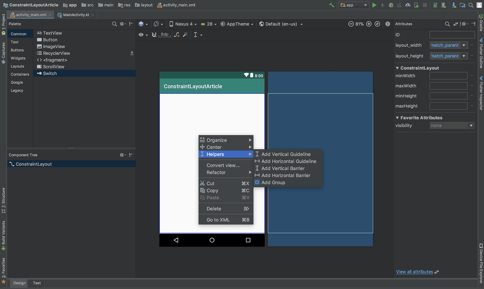
There are multiple ways of creating a guideline. You can add it directly on the XML file, or by using the layout design editor. To use the layout design editor, open the layout then right click on it and choose Helpers and select Add Vertical Guideline.
Here is a screenshot:
This adds this snippet to your layout XML file:
1<android.support.constraint.Guideline 2 android:id="@+id/guideline" 3 android:layout_width="wrap_content" 4 android:layout_height="wrap_content" 5 android:orientation="vertical" 6 app:layout_constraintGuide_begin="20dp" />
The guideline here has a vertical orientation because we selected that. A horizontal guideline will make the orientation horizontal. An id was generated so that other views can be aligned to it. Another attribute to look out for is the positioning attribute - layout_constraintGuide_begin="20dp" . This means that the guideline starts 20dp after the start of the layout.
Positioning our guidelines
There are three ways of positioning our guidelines:
- Specifying a fixed distance from the left or the top of a layout - (
layout_constraintGuide_begin) - Specifying a fixed distance from the right or the bottom of a layout -(
layout_constraintGuide_end) - Specifying a percentage of the width or the height of a layout -(
layout_constraintGuide_percent)
By default, when you create a vertical guideline on the layout design editor, it is positioned at the start. It will look like this:
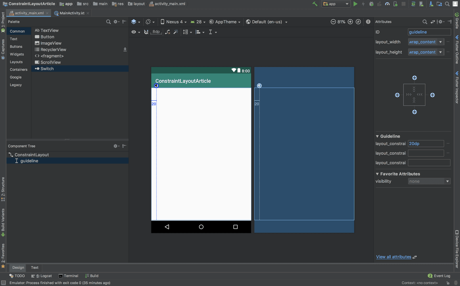
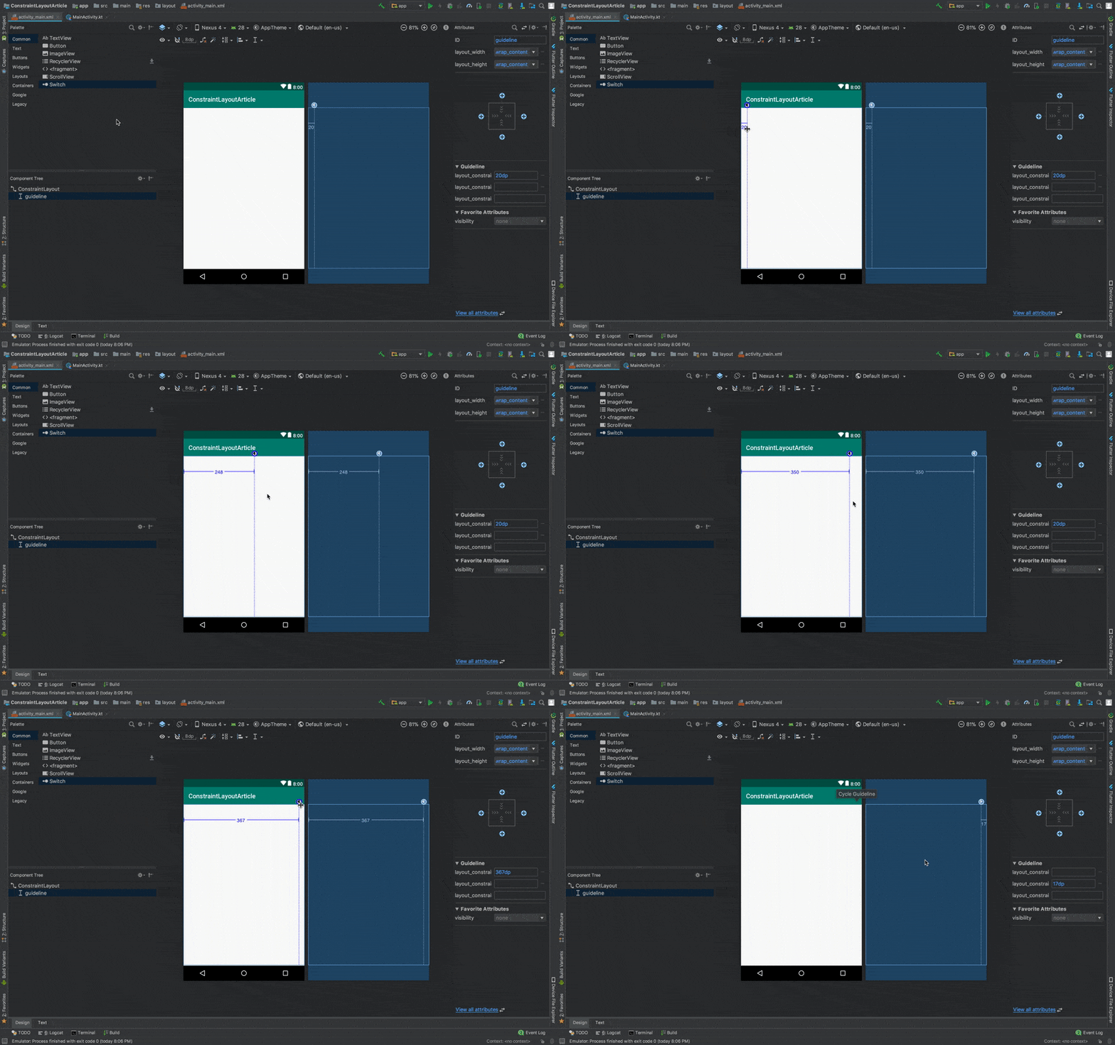
The guideline has a value of 20dp. If you want to position the guideline at the end, remove the app:layout_constraintGuide_begin attribute and add this - layout_constraintGuide_end or you drag the guideline to the right and click the play-like icon located on the toolbar like so:
Another method of positioning guidelines is using percents. You can achieve this by using the app:layout_constraintGuide_percent attribute. This expects a value between 0 and 1 to know where to place the guideline.
Just like with bias, a value of 0 will be at the start, left side, of the layout, 0.5 will be in the middle, and 1 will be at the end of the layout. On the design layout view, it’s shown as a value from 0 to 100.
In the same way we created a vertical guideline, you can create a horizontal one too. A guideline for a horizontal guideline can look like this:
1<android.support.constraint.Guideline 2 android:id="@+id/guideline" 3 android:layout_width="wrap_content" 4 android:layout_height="wrap_content" 5 android:orientation="horizontal" 6 app:layout_constraintGuide_begin="20dp" />
Since it is a horizontal guideline, and has a horizontal orientation, it will start 20dp at the top of the layout. The app:layout_constraintGuide_end attribute will set the guideline to the bottom of the layout. You can start adding your views and align them with the guidelines.
Groups
A group is one of the helper components of the constraint layout. Its main aim is to categorize views together. This is different from the usual ViewGroup we already know about in Android. While a group only contains a reference to IDs of other elements, a ViewGroup contains the actual views itself. A group is used to set the visibility of the views referenced in it.
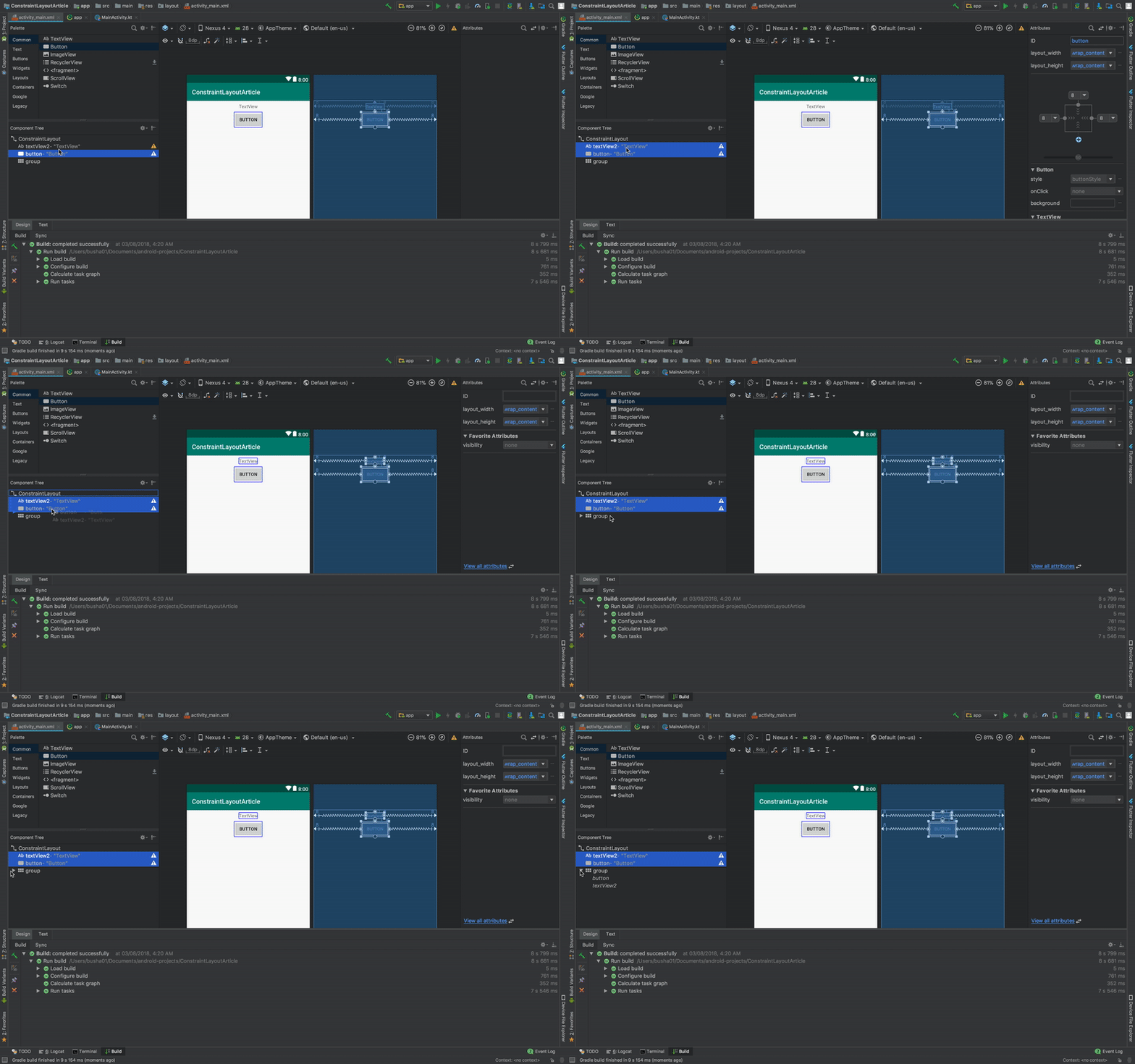
To create a group, right click on the layout, choose helpers, then select add group. After that, in the component tree, drag the views to the group you wish to add them to. See the screen recording below to see how to create a group:
This generates the following snippet in the XML file for us:
1<android.support.constraint.ConstraintLayout 2 xmlns:android="http://schemas.android.com/apk/res/android" 3 xmlns:app="http://schemas.android.com/apk/res-auto" 4 xmlns:tools="http://schemas.android.com/tools" 5 android:layout_width="match_parent" 6 android:layout_height="match_parent" 7 tools:context=".MainActivity"> 8 9 <TextView 10 android:id="@+id/textView2" 11 android:layout_width="wrap_content" 12 android:layout_height="wrap_content" 13 android:layout_marginStart="8dp" 14 android:layout_marginTop="8dp" 15 android:layout_marginEnd="8dp" 16 android:text="TextView" 17 app:layout_constraintEnd_toEndOf="parent" 18 app:layout_constraintStart_toStartOf="parent" 19 app:layout_constraintTop_toTopOf="parent" /> 20 21 <Button 22 android:id="@+id/button" 23 android:layout_width="wrap_content" 24 android:layout_height="wrap_content" 25 android:layout_marginStart="8dp" 26 android:layout_marginTop="8dp" 27 android:layout_marginEnd="8dp" 28 android:text="Button" 29 app:layout_constraintEnd_toEndOf="parent" 30 app:layout_constraintStart_toStartOf="parent" 31 app:layout_constraintTop_toBottomOf="@+id/textView2" /> 32 33 <android.support.constraint.Group 34 android:id="@+id/group" 35 android:layout_width="wrap_content" 36 android:layout_height="wrap_content" 37 app:constraint_referenced_ids="button,textView2" /> 38 39 </android.support.constraint.ConstraintLayout>
Notice that the IDs of the button and the TextView are referenced in the group. With this, you can set the visibility of the group and it will influence the visibility of the views whose IDs are in the group. This can come in handy when you have something like a group of input error messages you want to display or hide.
Barriers
Sometimes, we need to create dynamic layouts and views with dimensions that scale based on inputs we have no details about.
For instance, if we want to create a user profile data with a bunch of TextViews and we want to put the corresponding elements to the end of each. Typically, we could use nested linear layouts. However, we can use constraints to handle this a lot more efficiently by simply creating a barrier, and referencing the necessary IDs to the barrier.
A barrier is a virtual view that contains a reference to the views we wish to form a barrier against. It forms a virtual guideline based on the most extreme view in your reference list. If those elements increase in size, the biggest will be the one controlling the dimensions; the distance of the barrier to the side.
They can be created to the top, bottom, left or right of the referenced views. It allows other views to constrain themselves to the barrier and stops them from jumping or overlapping each other. This is particularly handful when dealing with different widget sizes that depends on some configuration or even applications that supports different languages.
Barriers could be horizontal or vertical. Let us look at the images below for a clearer understanding:
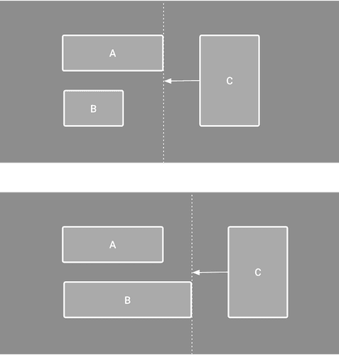
Above, notice that view C is constrained to the barrier. The barrier references the IDs of B and A. This means that the barrier is placed at the most extreme view out of these two views whose IDs are referenced. This is very useful when you don’t actually know the size of widgets.
Creating barriers
Let’s do a quick example of using barriers with three TextViews. Drag three TextViews to your the layout as seen below:
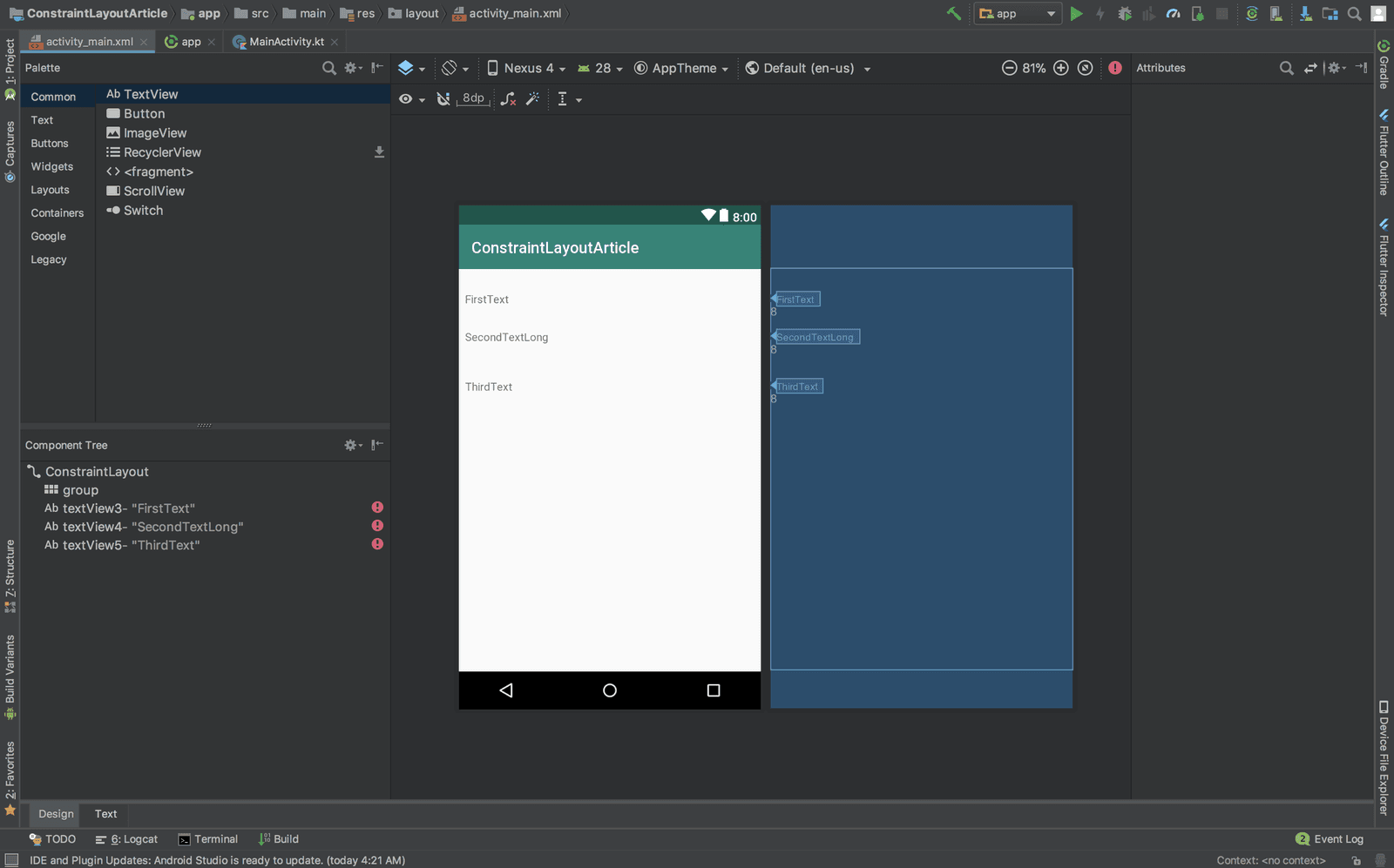
From the image above, we have three TextViews that are constrained to the left. We will now create a barrier.
To create a barrier, you can use the helper tool and select Add Vertical Barrier:
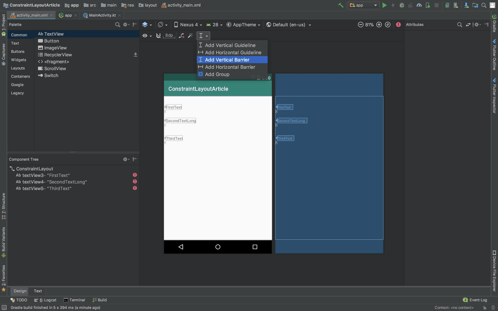
In the component tree, drag and drop the views you want to create a barrier around and drop it on the barrier like this:
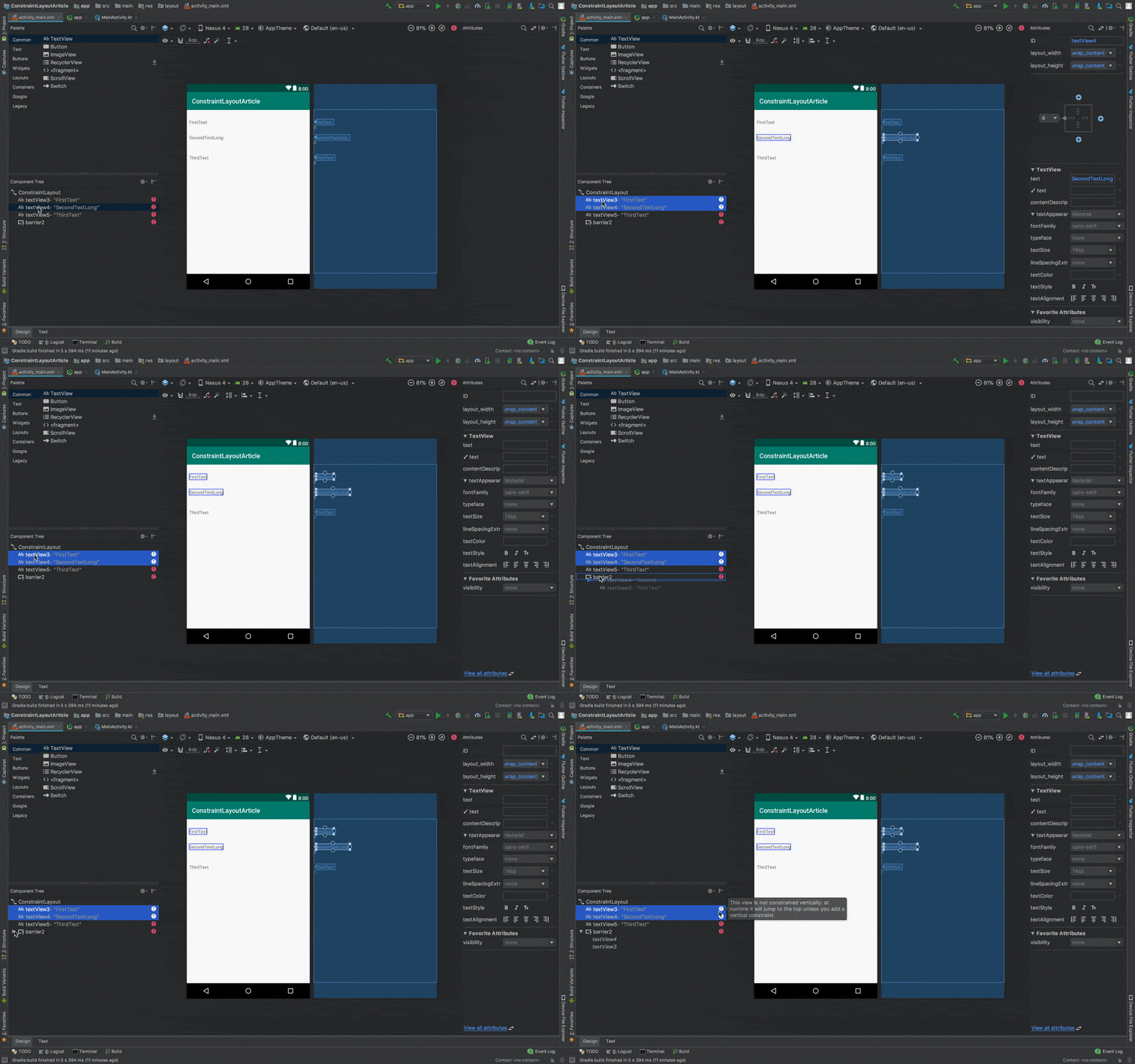
This generates this snippet in the layout XML file:
1<?xml version="1.0" encoding="utf-8"?> 2 <android.support.constraint.ConstraintLayout 3 xmlns:android="http://schemas.android.com/apk/res/android" 4 xmlns:app="http://schemas.android.com/apk/res-auto" 5 xmlns:tools="http://schemas.android.com/tools" 6 android:layout_width="match_parent" 7 android:layout_height="match_parent" 8 tools:context=".MainActivity"> 9 10 <TextView 11 android:id="@+id/textView3" 12 android:layout_width="wrap_content" 13 android:layout_height="wrap_content" 14 android:layout_marginStart="8dp" 15 android:layout_marginTop="20dp" 16 android:text="FirstText" 17 app:layout_constraintStart_toStartOf="parent" 18 app:layout_constraintTop_toTopOf="parent" /> 19 20 <TextView 21 android:id="@+id/textView4" 22 android:layout_marginTop="20dp" 23 android:layout_width="wrap_content" 24 android:layout_height="wrap_content" 25 android:layout_marginStart="8dp" 26 android:text="SecondTextLong" 27 app:layout_constraintStart_toStartOf="parent" 28 app:layout_constraintTop_toBottomOf="@+id/textView3" /> 29 30 <TextView 31 android:id="@+id/textView5" 32 android:layout_width="wrap_content" 33 android:layout_height="wrap_content" 34 android:layout_marginStart="8dp" 35 android:layout_marginTop="40dp" 36 android:text="ThirdText" 37 app:layout_constraintStart_toStartOf="parent" 38 app:layout_constraintTop_toBottomOf="@+id/textView4" /> 39 40 <android.support.constraint.Barrier 41 android:id="@+id/barrier2" 42 android:layout_width="wrap_content" 43 android:layout_height="wrap_content" 44 app:barrierDirection="left" 45 app:constraint_referenced_ids="textView4,textView3" /> 46 47 </android.support.constraint.ConstraintLayout>
By default, the barrier direction is set to the left and so it will position itself to be on the left-hand edge of the view that is furthest to the left.
In this sample, we want the barrier to be towards the right. We can change that by selecting the barrier from the Component Tree, changing its barrierDirection in the attributes window. You can also set the app:barrierDirection in the XML directly to right.
Finally, we then constrain the third TextView to the barrier instead of the parent by adding this to the TextView:
app:layout_constraintStart_toStartOf="@id/barrier"
We will now have something like this:
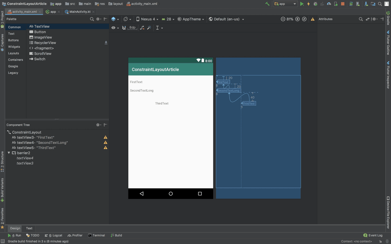
If the text of the second TextView adjusts, the barrier adjusts with it. With barriers, we have prevented a potential overlapping of views.
Conclusion
In this part of the series, we have learned about the constraint layout helpers - guidelines, groups, and barriers. We have seen how we can use them instead of nested layouts and how they can speed up development time.
In the next part, we will look at animations in ConstraintLayout.
You can find the repository for this project here.