Getting started with Auto Layout in Swift - Part 6: Understanding layout guides
Introduction
In the previous tutorial of the series, we took a dive into stack views and we learned how using them can make creating layouts a lot easier. In this part, we will round up the series by learning about layout guides and how it can make your applications usable when building with Auto Layout.
Prerequisites
To get started, you need the following:
- To have completed part five of the series.
- Xcode installed on your machine. Download here.
- Knowledge of the Xcode interface builder.
Let’s get started.
Understanding layout guides
In an earlier part of the series, we mentioned the safe area layout guide. Let’s talk a little about what layout guides are and how you should use them to make sure your application does not fall outside the view area of the user.
Deprecated layout guide
Before iOS 11, Apple provided the topLayoutGuide and bottomLayoutGuide. With these guides, you could constrain your content so it does not get hidden by elements at the top of the view or elements at the bottom.
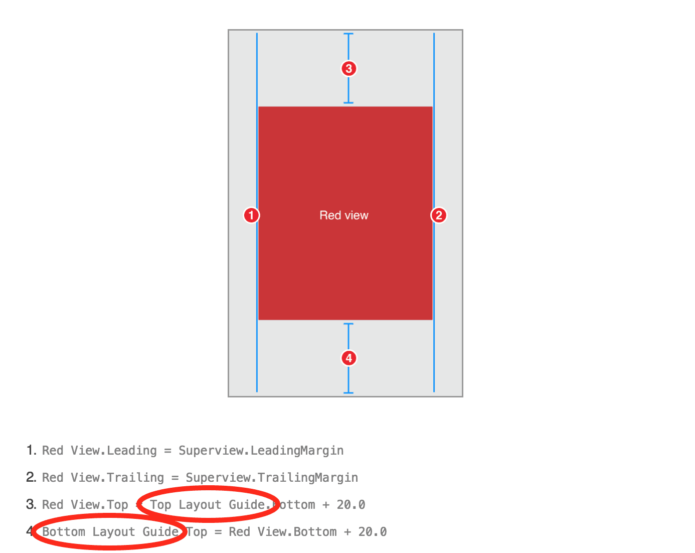
These layout guides were important when developing iOS apps pre-iOS 11 era.
Safe area layout guide
The safeAreaLayoutGuide was introduced in iOS 11 while the top and bottom layout guides were deprecated. The safe area layout guide is a single rectangular guide that encompasses the entire view.
Because the safe area layout guide is a single guide that is boxed in, it’s a lot easier to work with this layout guide.
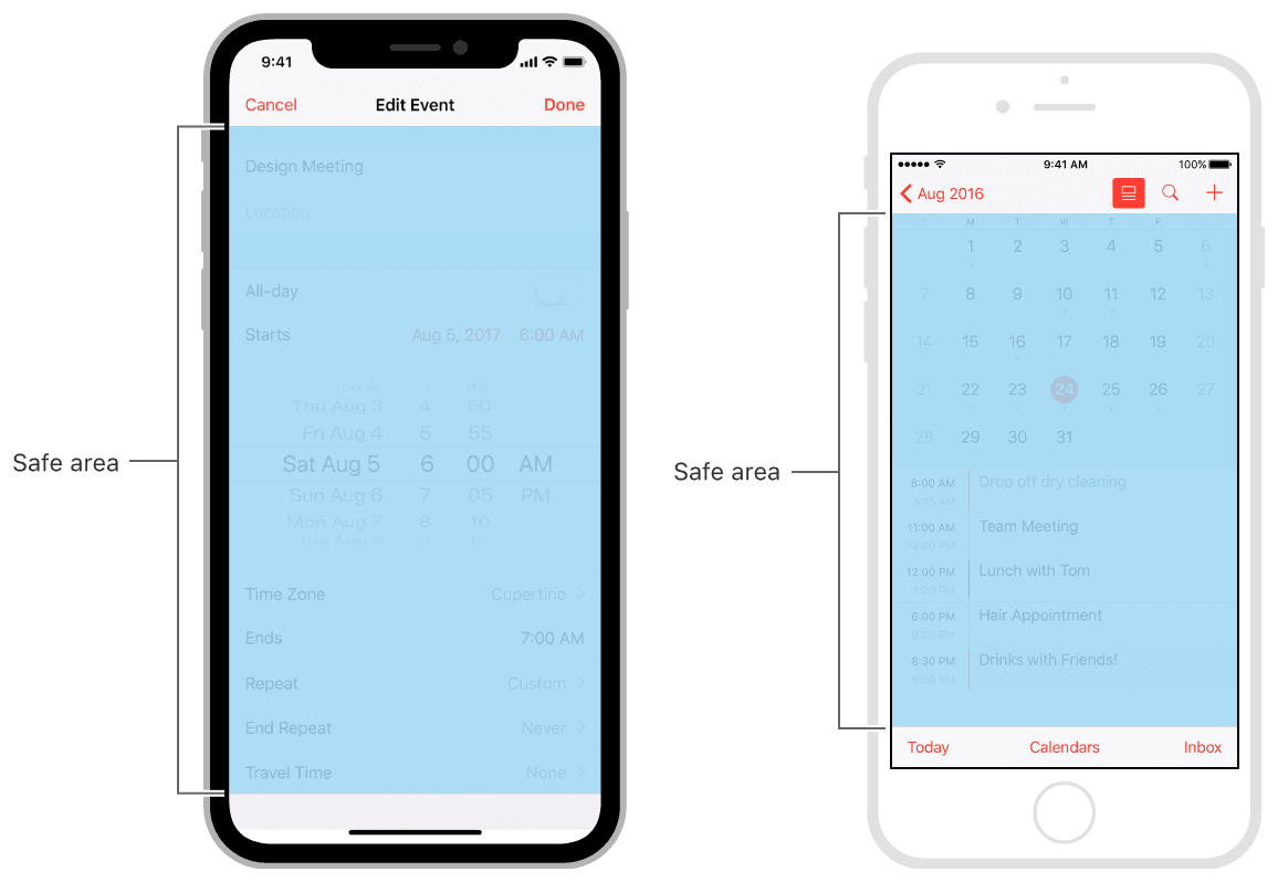
As seen above, the safe area layout guide will box in the areas that are safe to add content to. Adding content outside this area may cause it to be hidden by the content outside the safe area, thus making the content there potentially unusable.
Safe area layout guides work differently for each device. The iPhone X, or later, has a bottom layout guide that considers the on-screen home button. The iPads have a bigger safe area layout guide, and the iPhone 5s, a smaller one.
To demonstrate how the safe area layout guide helps us keep content in check, let’s create a sample project and play around with it.
Creating a sample Xcode project
For the purposes of this chapter, we will be creating a sample Xcode application. We will be playing around with this sample app throughout this chapter.
Launch Xcode and click Create a new Xcode project. Next, select Single View App in Xcode.
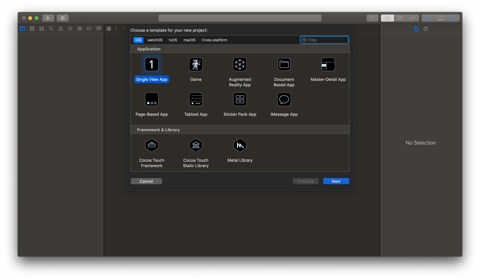
In the project, open the Main.storyboard file. We will be using the storyboard to play around with views and layouts.
Now that we have the sample project, let’s continue.
Working with the safe area layout guide
Open the main storyboard and drag a label to the topmost left of the screen. Now drag another label to the top right of the screen as seen below:
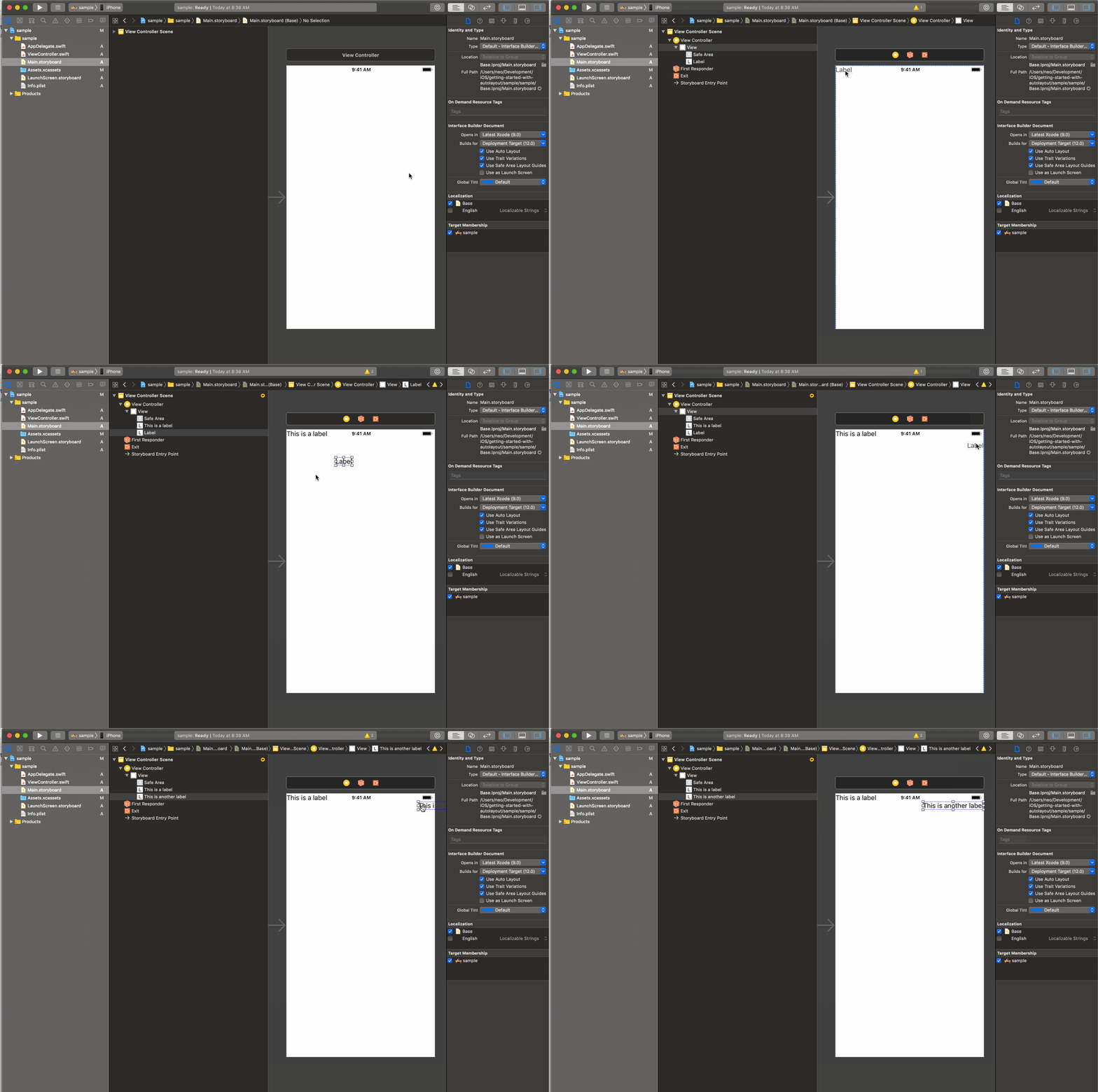
After creating the labels, let’s add some constraints to them. We will add the first constraints to the label on the topmost left. We want to make sure it is pinned to the top left of the view.
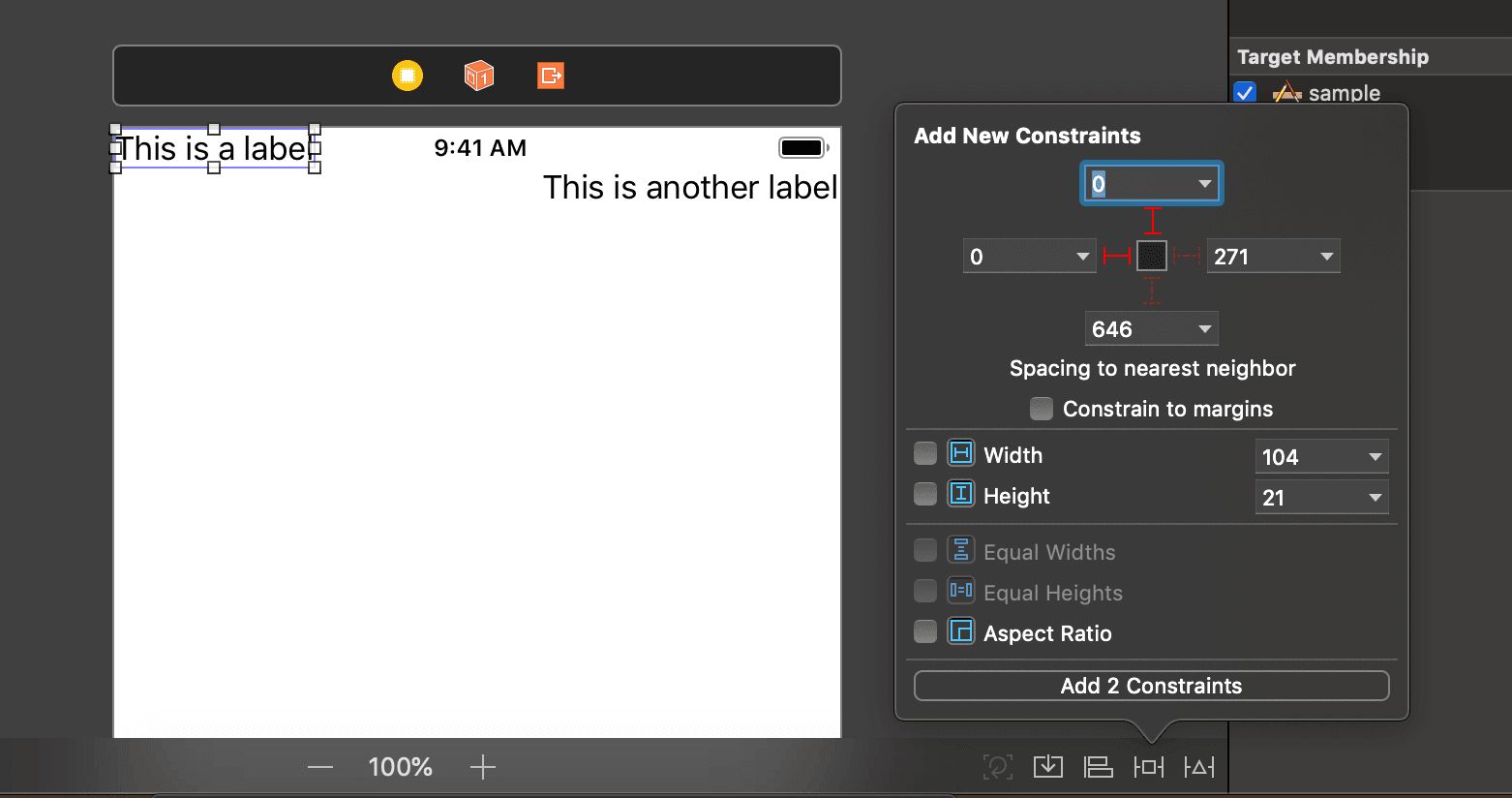
Now for the second label, add the constraints as seen below:
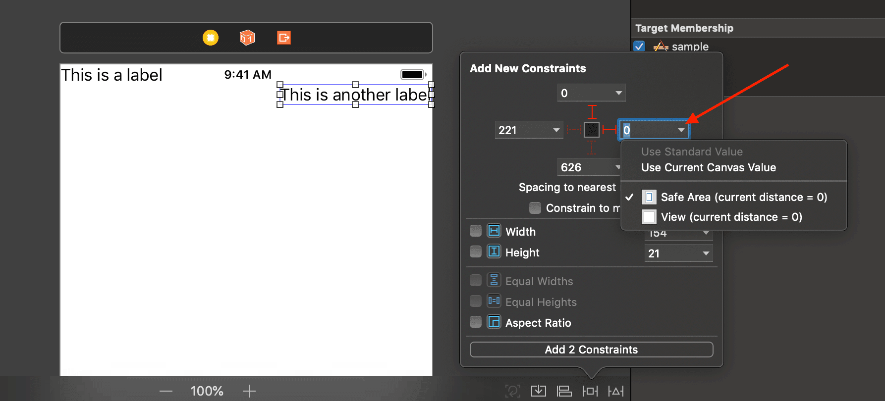
Note that in the second example, we clicked the little bottom facing arrow beside the number to reveal a drop-down menu. In this menu, we have the options of setting Safe Area or View. The safe area refers to the safe area layout guide, while the view is the super view.
Now launch the application in an iPhone X simulator, and then in an iPhone 8 simulator:
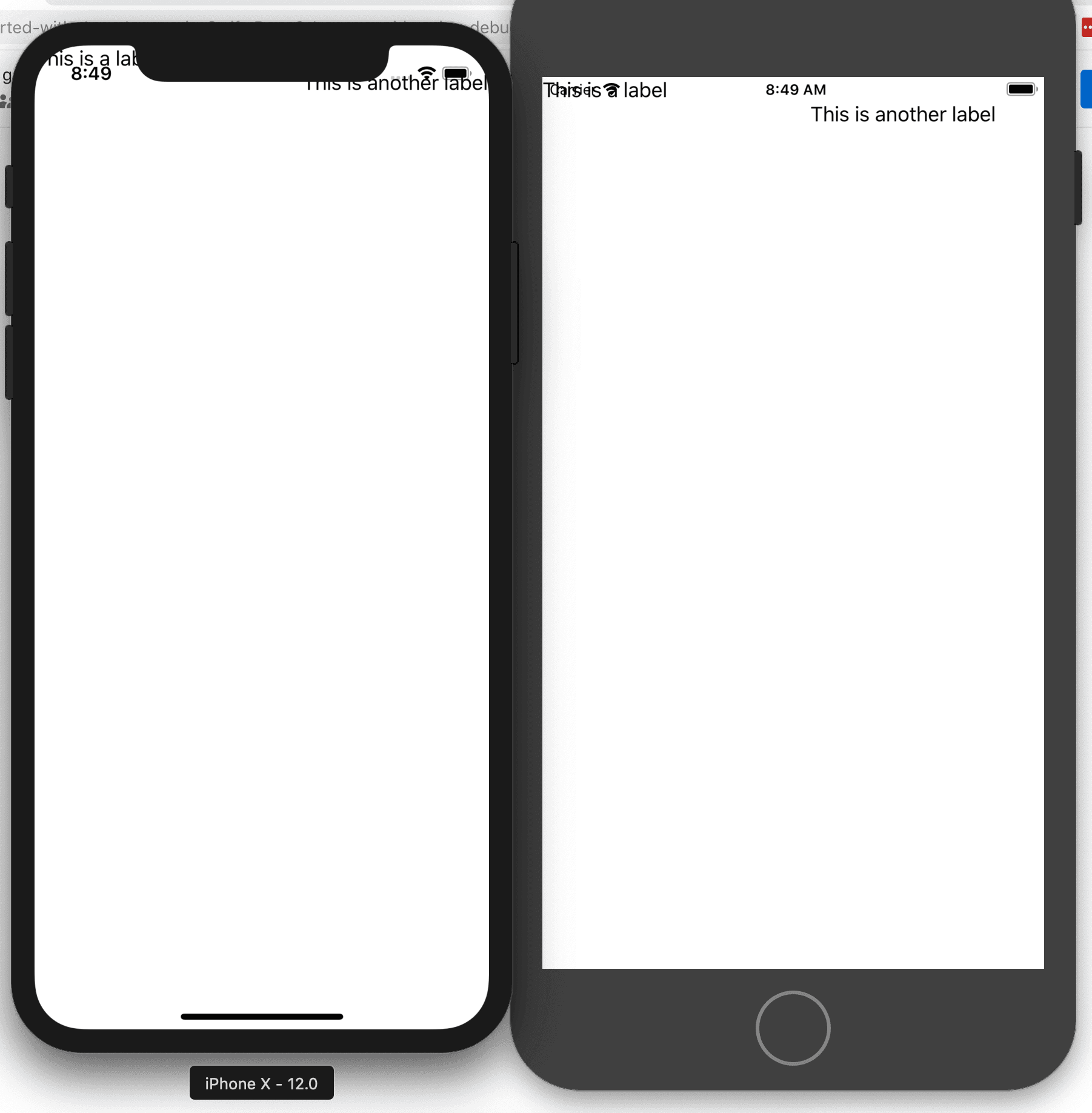
As seen above, the label pinned to the top super view overlaps with the status bar in both cases while the one pinned to the safe area layout guide is not.
Let’s do the same thing for the bottom of the screen. Add two new labels one at the bottom left and one at the bottom right of the screen. Next, add the following constraints to the label at the bottom left:
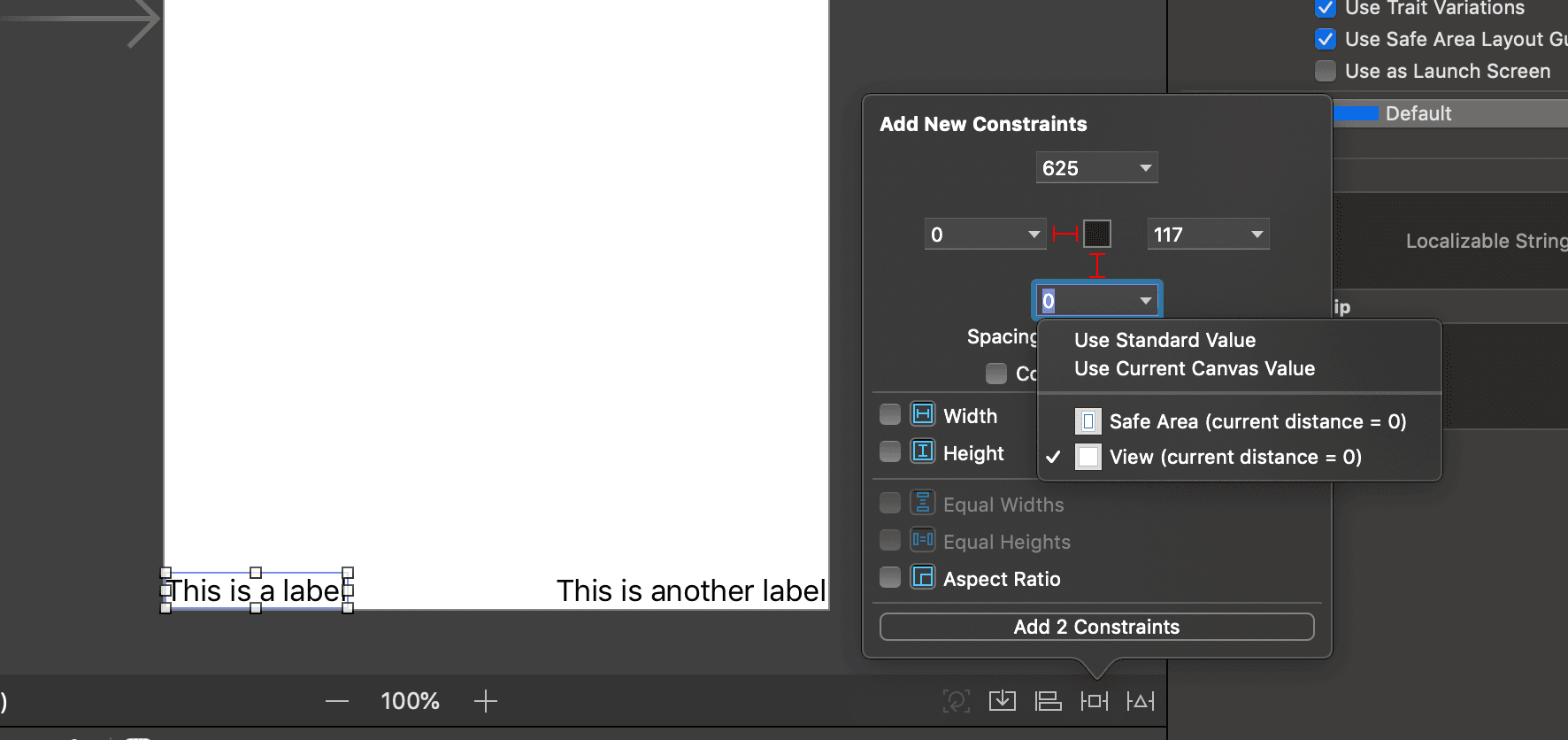
Make sure you set it to pin to the super view, and not the safe area.
Next, add the following constraints to the bottom right label:
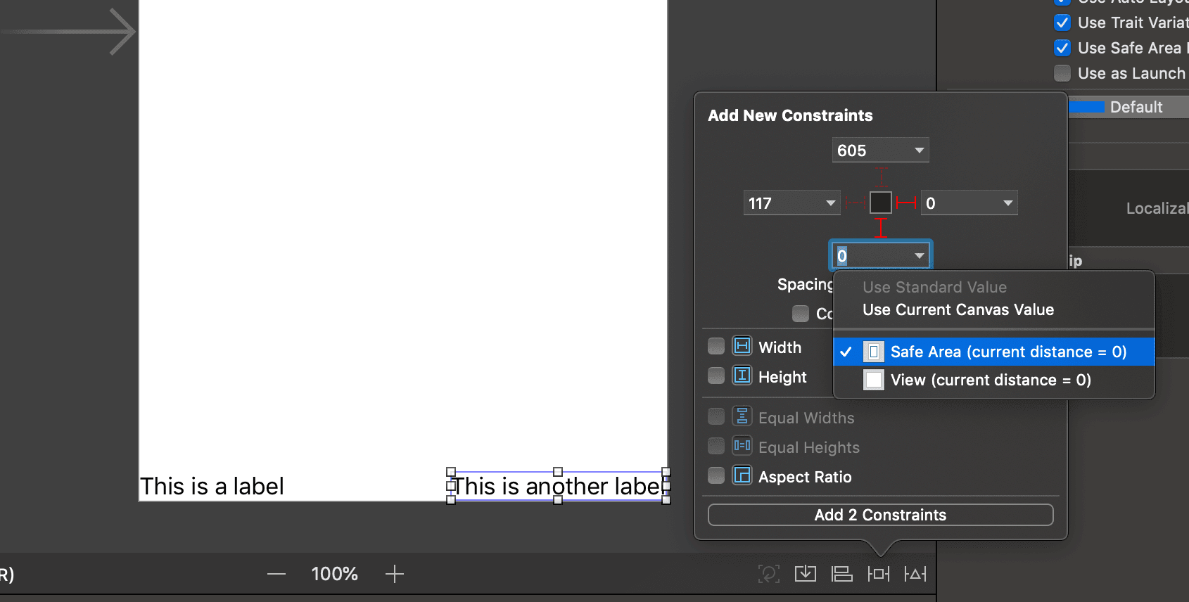
Make sure you pin it to the safe area not the super view,
Now launch the application once more in an iPhone X simulator and an iPhone 8.
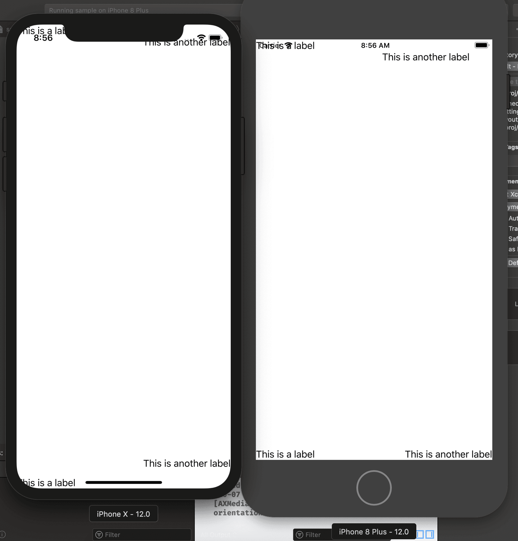
Just like before, the label pinned to the bottom left super view overlaps with the content at the bottom of the screen on the iPhone X. The label on the right pinned to the safe area view does not.
Notice, though, on the iPhone 8 the labels does not seem to overlap any content. In fact, the label seems just fine whether it’s pinned to the safe area guide or not. This is one reason why you should always pin to the safe area layout. Depending on the device the application is being loaded on, there might be overlaps.
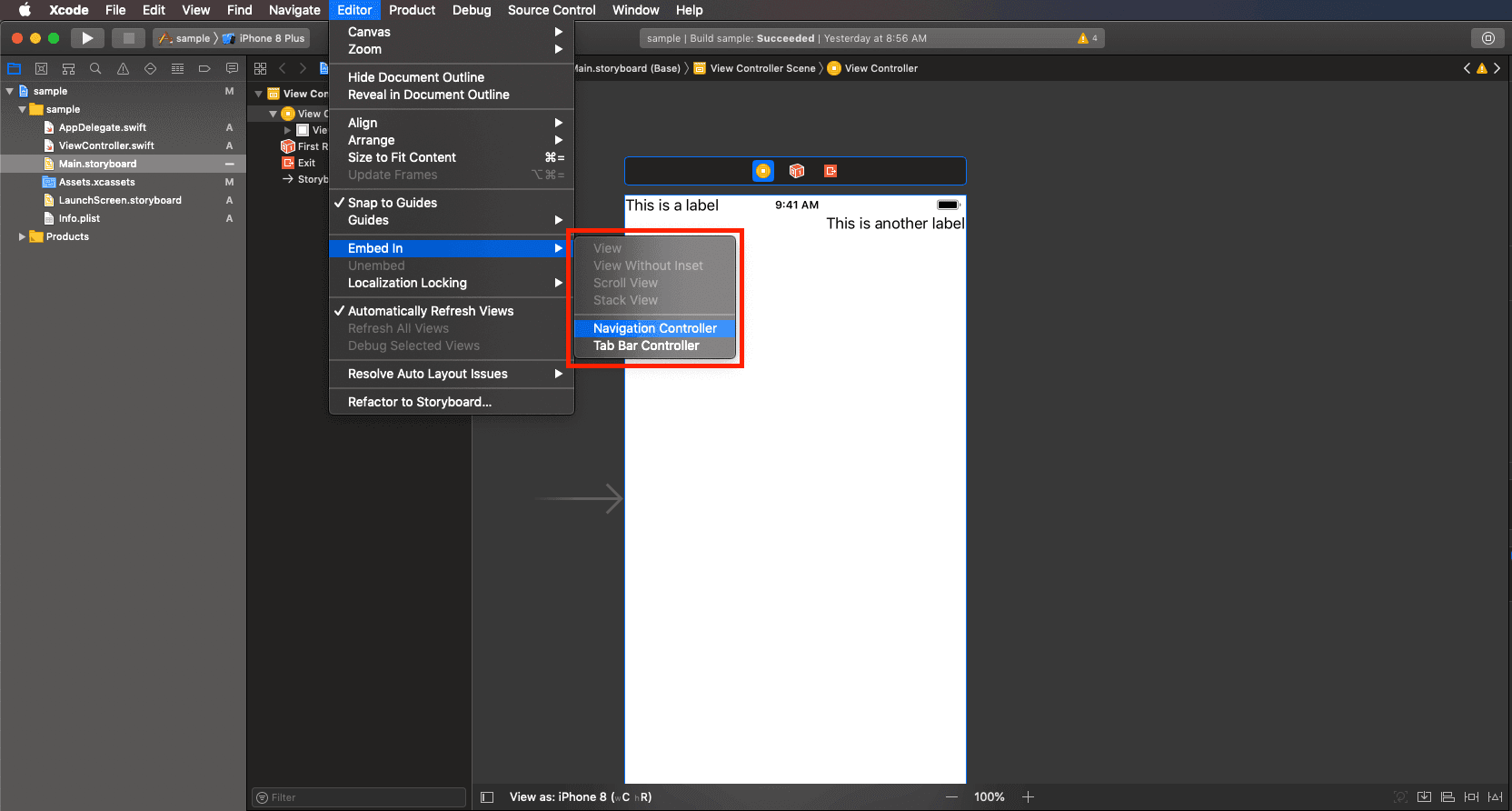
Let’s see another reason to add views within the safe area. Open the storyboard and click on Editor > Embed In > Navigation Controller to embed the current view controller inside a navigation controller:
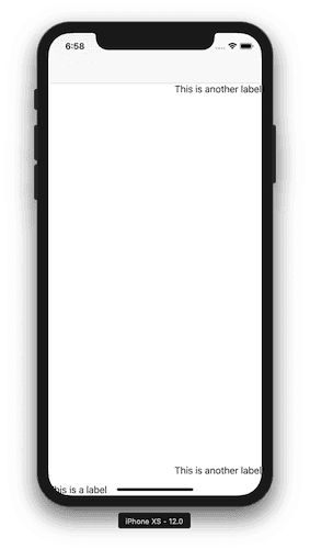
Now run the application in a simulator. You will see that the label that was pinned to the super view was completely hidden by the navigation bar. However, the other label that was pinned to the safe area readjusted to make sure it is in the viewing area of the application.
Using the safe area layout guide is invaluable when working with Auto Layout.
Conclusion
In this part of the series, we have looked into layout guides and why they are invaluable when building layouts using Auto Layout.
In this tutorial series, we have taken a deep dive into Auto Layout and how you can use it to create amazing layouts that work across multiple devices. As with everything else, practice makes perfect. Practice using Auto Layout in your projects and you’ll get better at it.
The source code to the application built in this series is available on GitHub.